What's in a name?
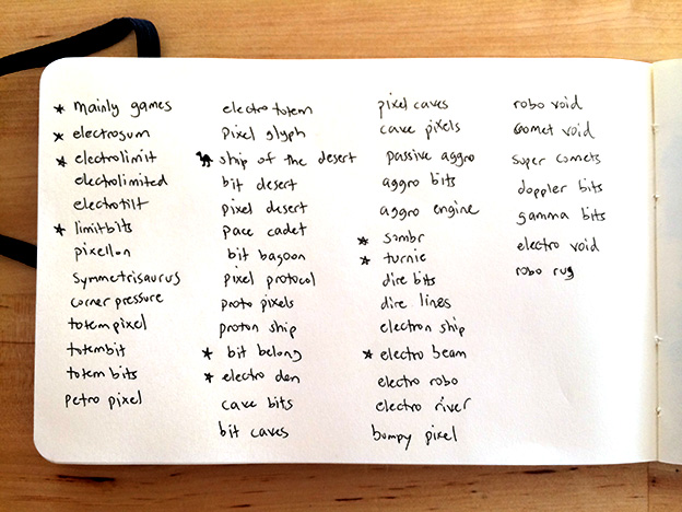 Some good and not-so-good ideas here...
While working on the Unity prototype, I was keeping a running list of potential studio names in the background. It might not seem important this early on, but having a name and logo solidified gives me a "foundation" or "home" to nurture the project along. I also wanted to register the domain and set up this blog to keep pace with development without getting too far behind.
In fact, that will most likely be a running theme here. It's common advice to not get bogged down in details / rendering / polish too early, but I think there's a gray area there that needs to be explored. If you only work on foundation and roughs, it can sometimes lead to exhaustion since you don't see the "fruits" of your labor. I think a little bit of continual polish keeps your excitement level up for a project – and that's just as important as anything else in long dev cycles. If you feel like a little polish and it's not conflicting with your immediate needs or development schedule – go for it! It's healthy.
I definitely understand the argument that a company name isn't that important and it's the quality of product that (mostly) determines success, but it's important to me. I had some criteria:
- Concise: I didn't want something too lengthy. I've always been partial to short names, though this can make it difficult to choose something that hasn't been taken. Sombr is definitely concise, and dropping the "e" – while a little Web 2.0ish – helps keep it unique. A quick search didn't turn up any "Somber" game studios or conflicting interests.
- Easy to say: I didn't want to have to repeat my company name a few times during introductions. For some reason, that always weakens it for me. I liked some of the names on my potential list quite a bit, but they just didn't roll off the tongue. A little bit of alliteration goes a long way, and some of these names had an uncomfortable cadence between the words.
- Easy to spell: I know, I broke this rule. But hey, the missing "e" gives it character, right? Excuses, I know. That's ok – I'm alright with 4/5 of my naming criteria. Secretly, I'm not ok with that, but don't tell anyone. Truth be told, it's still easy to spell, but it does require a quick disclaimer when spoken. Hopefully I don't regret this. :)
- Meaning: This is probably the most important criterion and it certainly goes without saying, but your company name should definitely mean something to you. Have integrity and put your all into everything you do; you should be proud of the home that the rest of the world sees from the outside, and imagine that the company is always a reflection of your values. Sombr means many things to me, some personal and some not. In a casual sense, I've always liked sad / melancholy / pensive works of art and music, and I've also believed that sadness can be just as "positive" as happiness in that both experiences are powerful and emotional, and worth feeling. This doesn't mean our games have to be sad. :)
![]() Sombr logo iterations
Sombr logo iterations
I worked on many iterations and sketches to settle on a logo design. What you see here is the last batch after I had already settled on typography and a general “flow” of the elements that make up the design. You can see that I had some elaborate trim and eventually arrived at something more simple. I liked some of the explorations in the first column, but they also felt a little immature and impulsive; I could just “feel” myself losing the trim years later and being much more satisfied with the simplicity, so might as well cut the fat now. As I progressed I made some minor variations to the type, such as removing the large gap between the “M” and the “B” and adjusting the swirly tails. For those that are interested, this is based on a modification of the Rebucked font by UnAuthorized Type.
I actually liked the original stand-alone version, but also wanted a recognizable, iconic element that could stand on its own without the type. The little wedge shape above the “M” lent itself well for imagery placement, so I explored some options here. I loved designing all these little icons, but some didn’t make sense with the “somber” theme. In the end I settled on the candle flame. It fits the mood perfectly, has a pleasing shape, and is also vague enough so as to avoid pigeon-holing the company in future projects.
![]() These final images are actually all high-resolution. This is just a scaled-down version for this post.
These final images are actually all high-resolution. This is just a scaled-down version for this post.
As a final step, I created low-resolution pixel versions of the logo and icon at various sizes. “Nearest neighbor” scaling in Photoshop is your best friend here to preserve hard edges without anti-aliasing, but there are really no shortcuts. It rarely works to just scale down a vector or high-res image for pixel art – a common rookie mistake. You can start with a scaled down version as a rough guide, but it’s best to intentionally trace or redraw images using the pencil tool for best results. You can see that the flame, swirls, and general letter stems needed special treatment to read properly at very small sizes. Attention to detail is a virtue!
I hope you enjoyed this rundown of name to logo, and it gives you some inspiration for your own company name!